Background Edits
Eyestrain warning: due to several examples featuring bright colors that may trigger photosensitive headaches or epilepsy, many example images are linked instead of directly embedded.
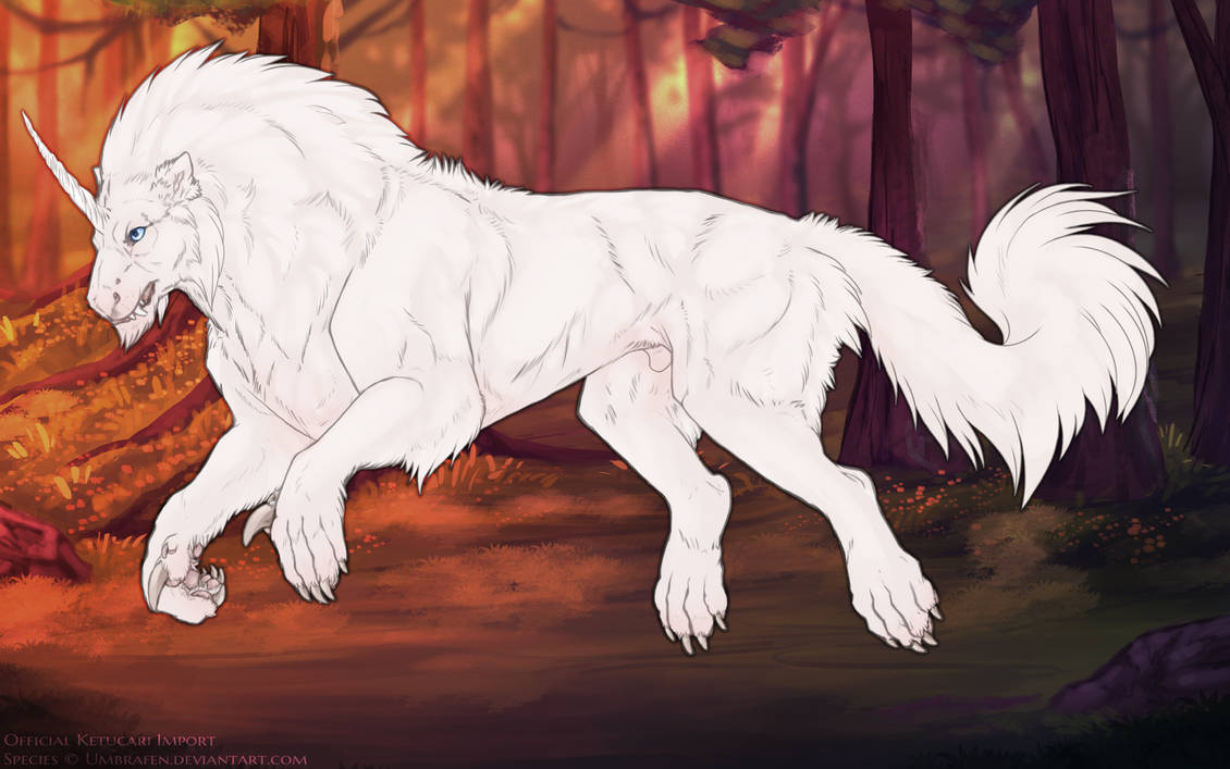
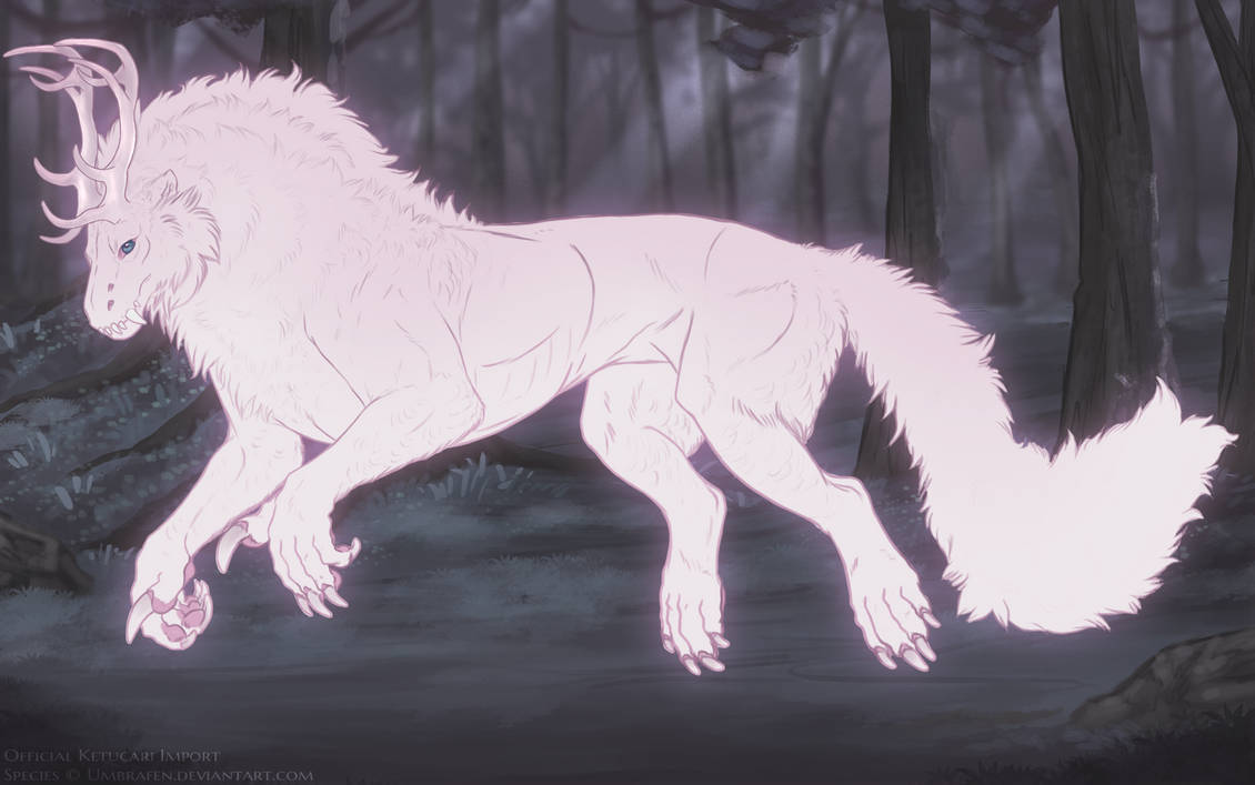
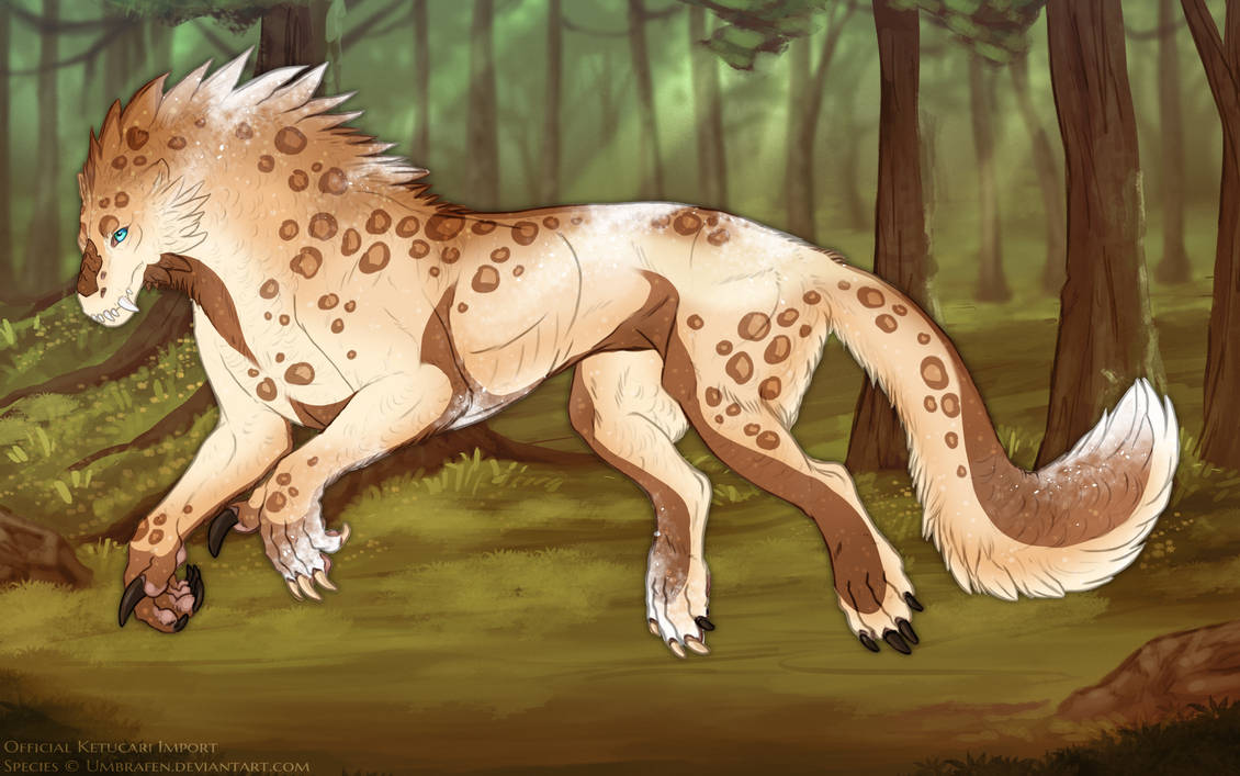
Some leeway is allowed with background edits when submitting a ketucari. In general, the only permitted edits are color shifts and light gradients. Any noticable alteration to the background art itself is not allowed. Please do not reference Ketixi designs for Ketucari backgrounds-- Ketixi use Rixixi background design rules.
However, a great deal of creative freedom is allowed within those confines! Here's a few examples of what is and isn't allowed in backgrounds, using an admin's fursona as a model. While almost all of the examples present here use the default background, both zone objective and elder BGs can be shifted according to these rules.
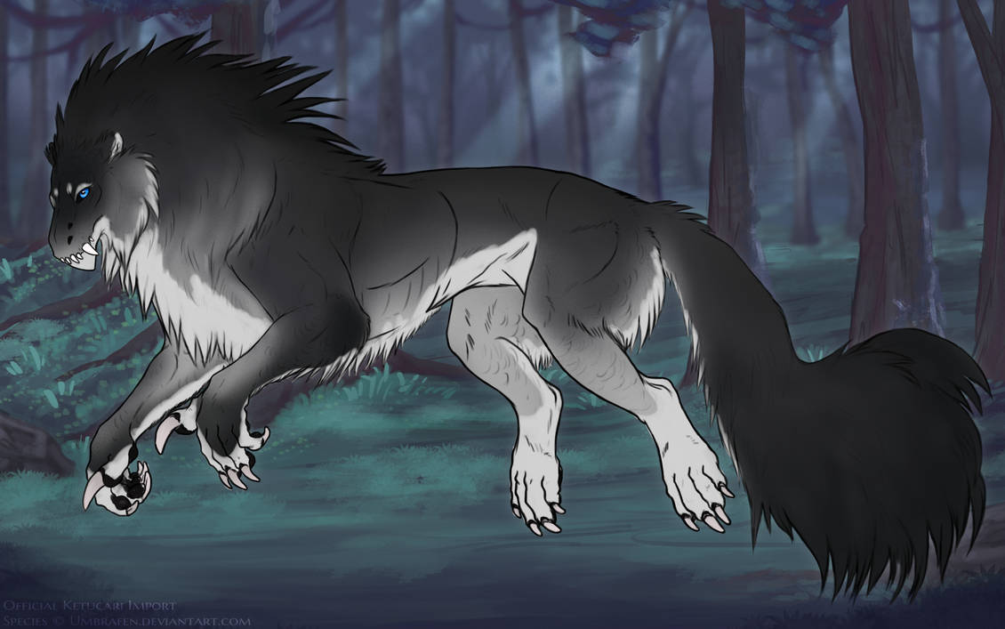
"Yo."
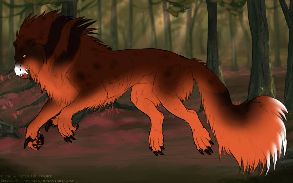
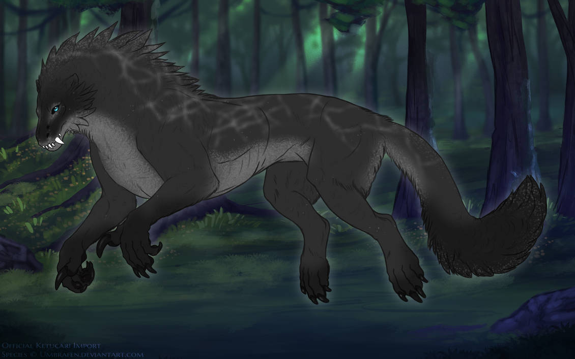
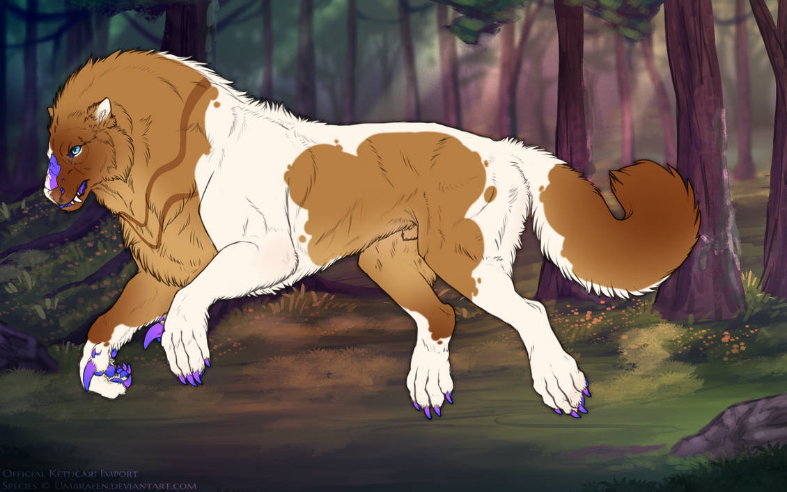
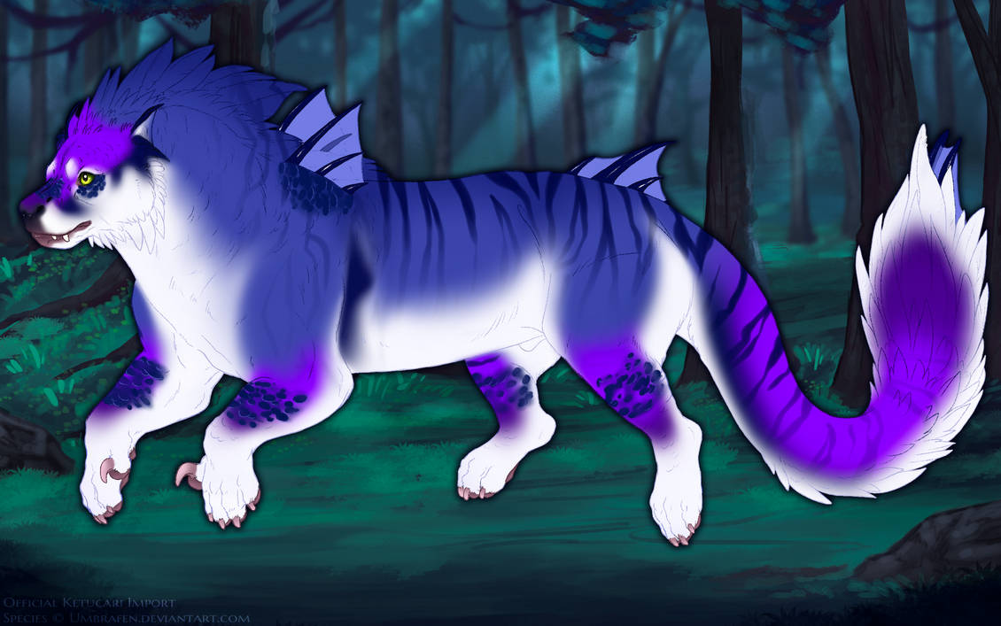
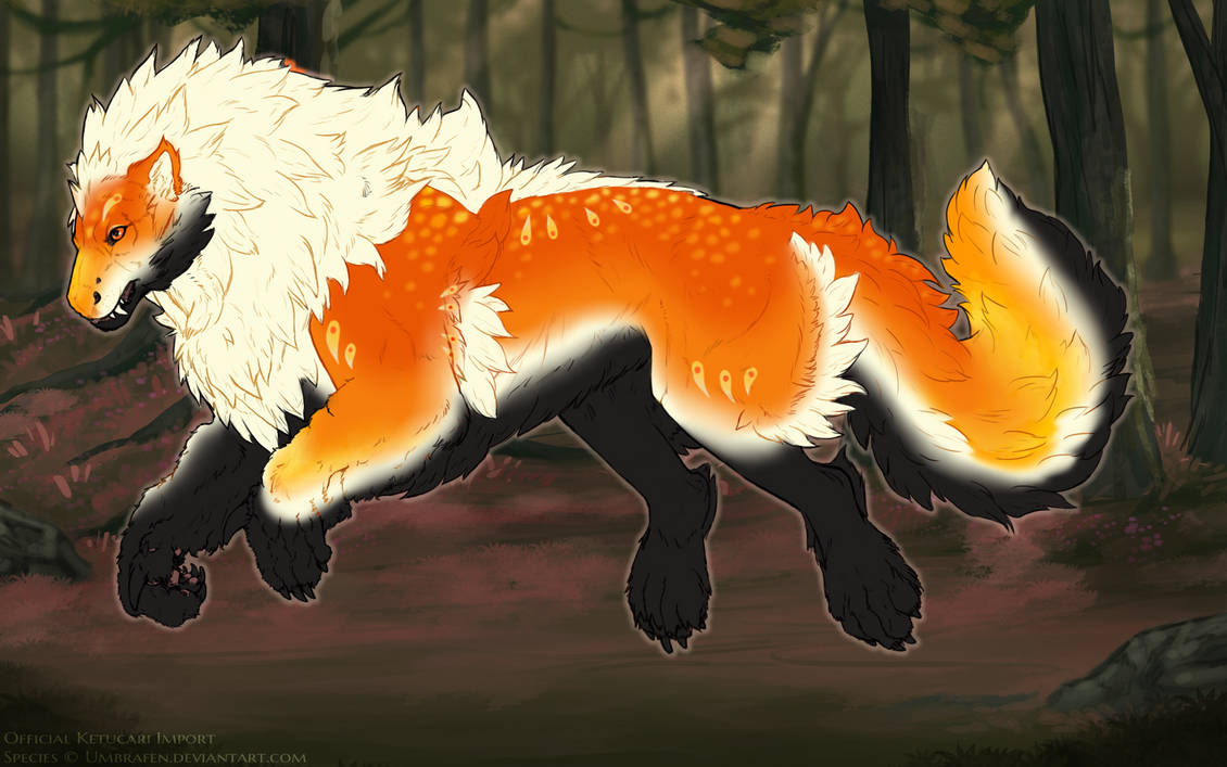
This is an example of a commonly-used color shift, using HSV adjustment. Additionally, a light halo was placed around the ketucari to make em pop out more from the background. HSV shifts can go anywhere in the hue wheel, and a fair bit of allowance on value is allowed. There's no hard numerical limits on this, but as a general rule, the background should still be clearly readable (i.e. not too dark or light to see.) Additionally, an overly bright or eye-straining background will be rejected.
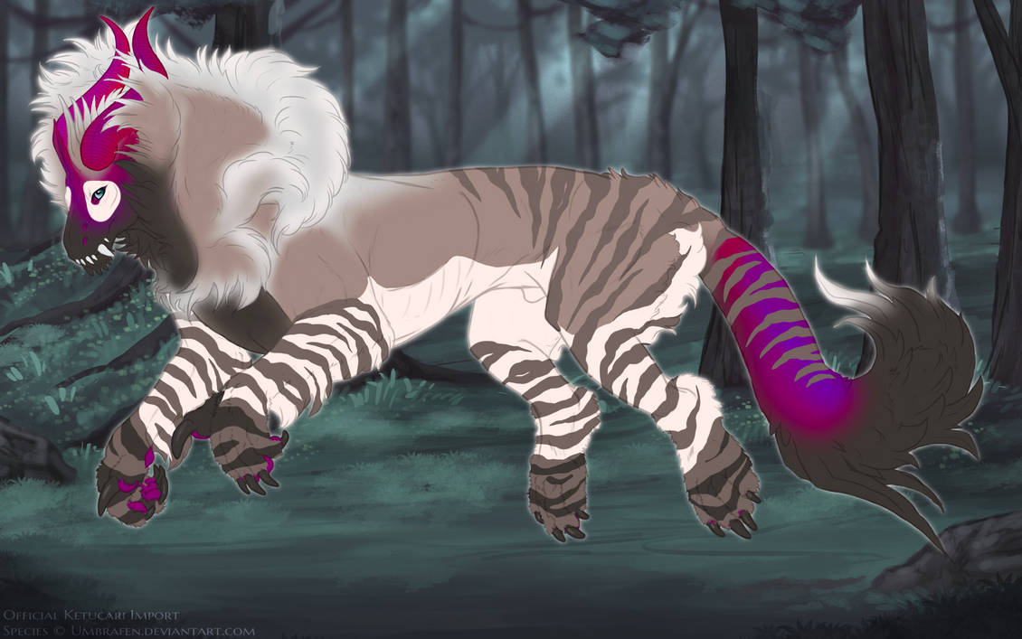
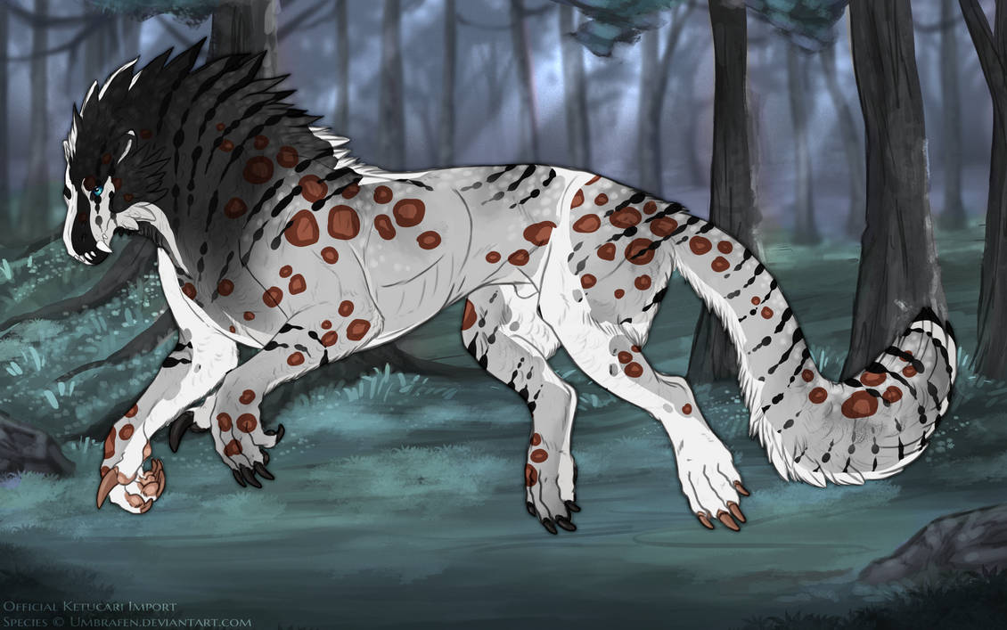
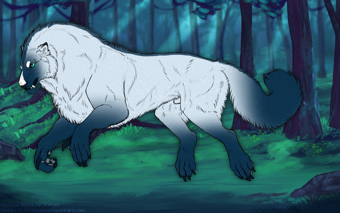
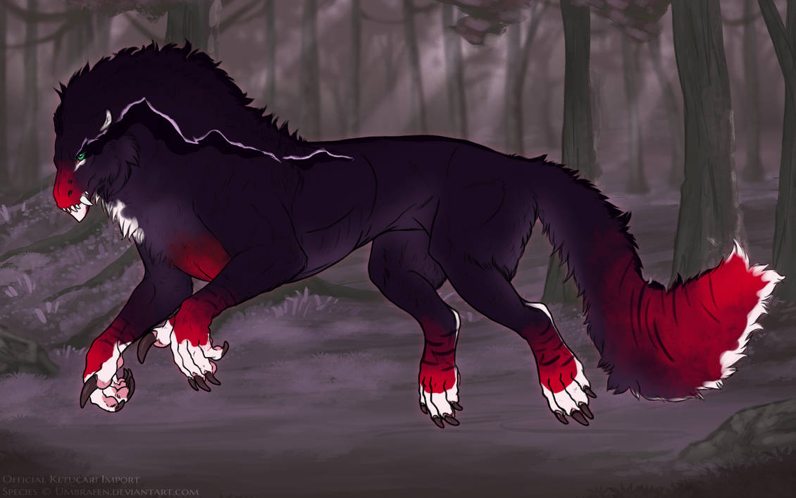
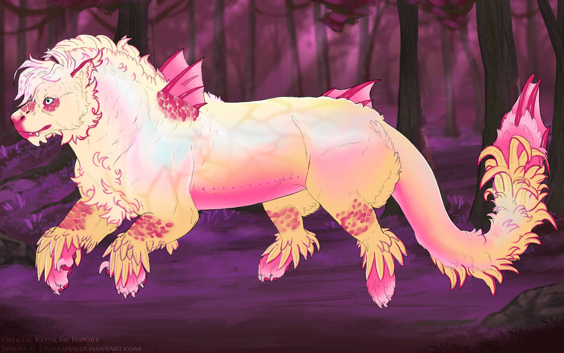
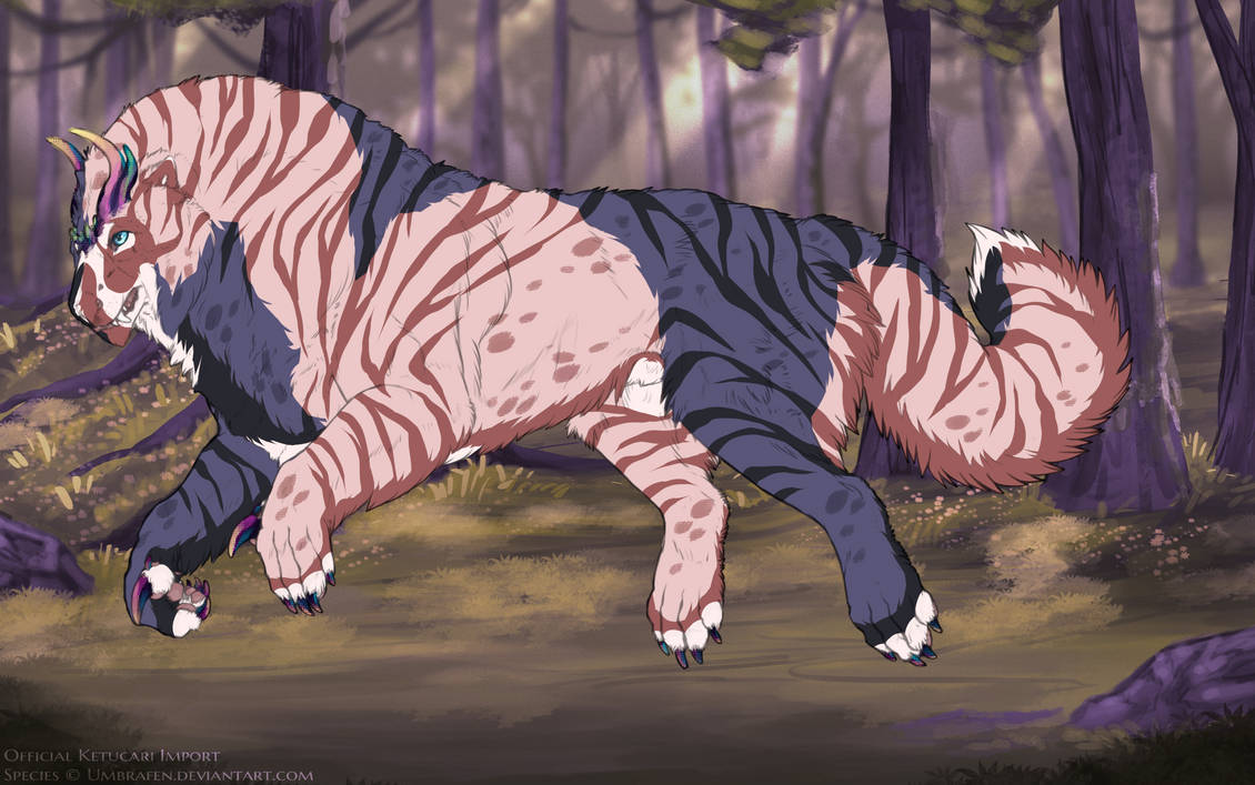
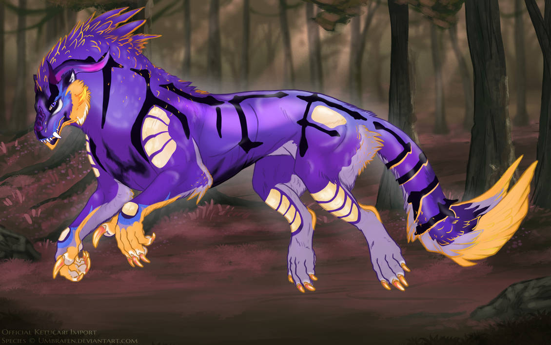
Some player ketucari examples of acceptable moderate hue shifts:
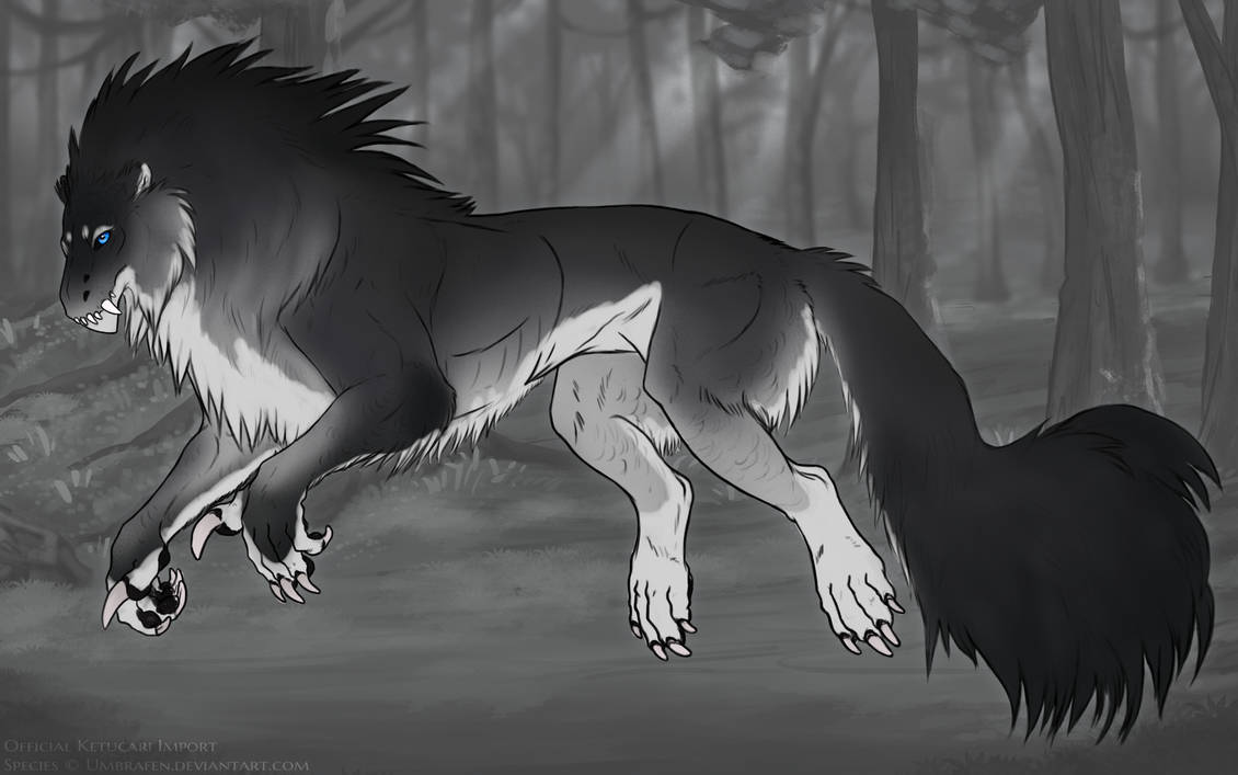
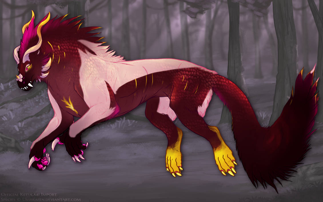
However, much more drastic shifts are allowed-- including desaturating a background nearly completely. However, increases to lightness and saturation, especially in combination, can easily make a background too bright to be acceptable (example linked, eyestrain warning). Remember, a background should complement your character, not overwhelm them!
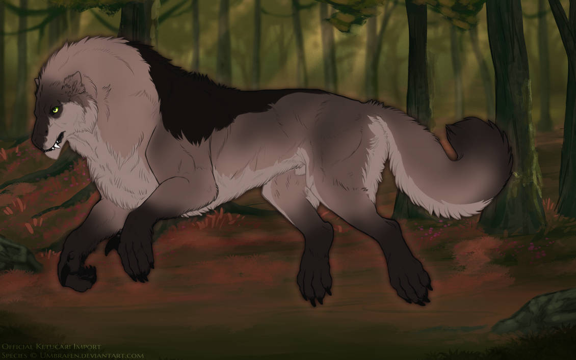
Some player ketucari examples of acceptable drastic color shifts:
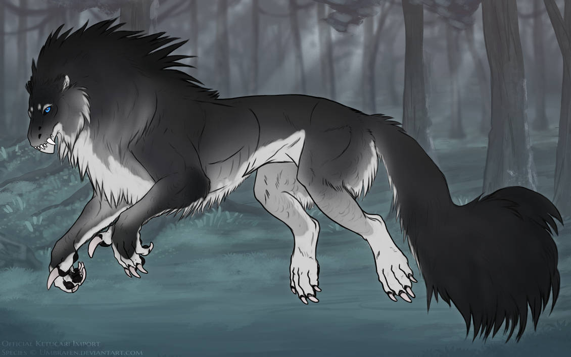
Additionally, backgrounds can be recolored with a light gradient on an unobtrusive blending mode. The background should be still clearly discernable, and the gradient should not overwhelm the background. A gradient that is too strong will draw the eye away from the ketucari! This example combines a desaturated background with a light vertical gradient to colorize the ground.
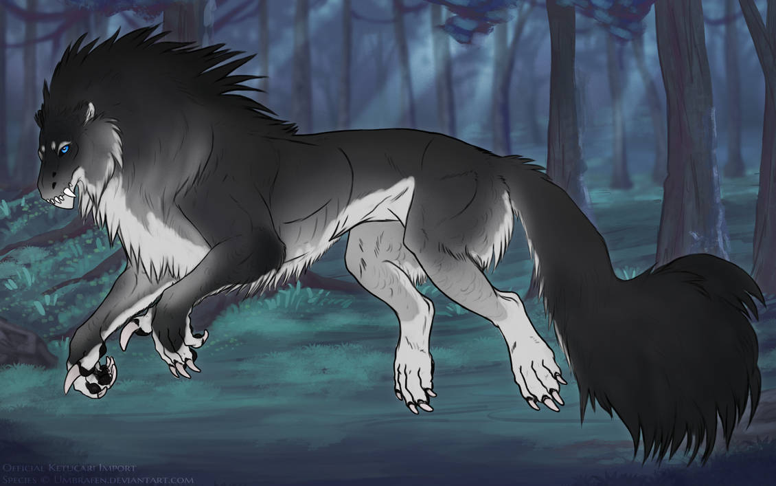
This background adds a light radial gradient to the hue-shifted background seen in the first example, adding the effect of moonlight through the trees. This stronger gradient is close to the borderline of acceptable, but is still acceptable. (linked)
This stronger gradient is unacceptable due to a combination of color contrast and gradient strength. (linked) This is another example of a strong gradient that would not be acceptable, without a ketucari for better visibility. (linked)
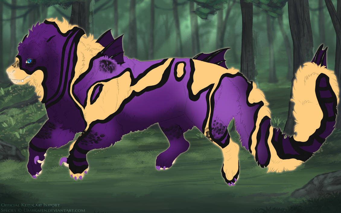
Some player ketucari examples of acceptable light gradients:
AS A GENERAL RULE: Please try to avoid saturating the background, or do so very carefully. Layer filters such as Color Dodge, Linear Dodge, are also typically discouraged. Anything that will overall increase the "Brightness" of the background is more likely to be rejected as it's more likely to cause eye strain.
Halos
In order to make a ketucari stand out a little more on the background, a light or dark halo or shadow can be placed under them. A halo should be fairly subtle and not resemble an Elemental Blessing. This can be accomplished by either keeping it fairly close to the ketucari, or fading it into the background. For instance, something like this is probably a little too bright. (link)
Some player ketucari are linked below to show how various designers produce a halo. Please click through to view them at full size!
Other
Background edits that are not acceptable under any circumstances: (each line is a link, eyestrain warning)
